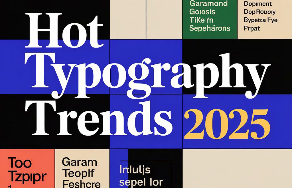
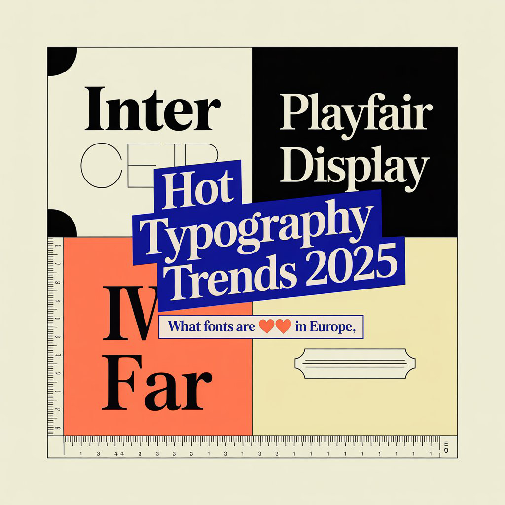
Typography isn’t just about choosing a pretty font anymore—it’s a highly powerful expression of brand voice, culture, and clarity. Across Europe and others countries design studios are breaking traditional rules, reintroducing heritage styles visualizations, and pushing type to its creative edge. If you want to know what’s hot in the typography scene of Europe, buckle up. This trend wave is bold, hive experimental, technical and rooted in both purpose and identity.
🎨 1. Neo-Grotesque Fonts Are Taking Over
Simplicity is sexy again. Neo-grotesque typefaces (like Helvetica Now, Neue Haas Grotesk, and Söhne) are dominating brand identities in Eauropiens, the Netherlands, and the UK. These fonts are minimal, neutral, and perfect for tech, finance, and minimalist DTC brands.
➡️ Want a brand that feels timeless and intelligent? Talk to us at Sceniox.
🧬 2. Variable Fonts = Flexibility with Style
Designers love control, and variable fonts give them just that. European studios are embracing them for responsive designs—web, print, apps—you name it. They’re lighter, faster, and offer dynamic customization without the need for multiple font files.
Bonus: Google and Adobe Fonts have tons of free variable options.
🎯 Want your brand to scale across every platform? Let’s make it happen.
✍️ 3. Hand-Drawn & Humanist Fonts Are Back
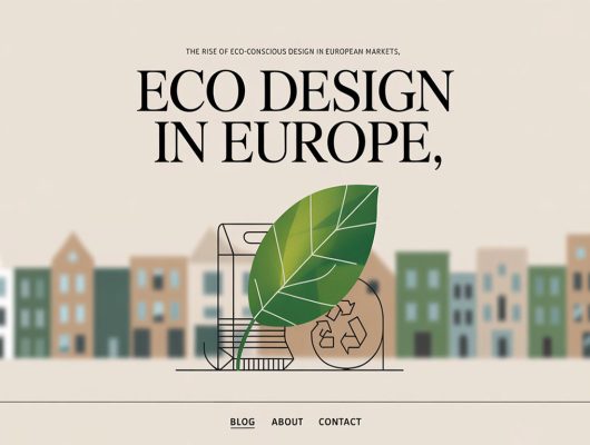
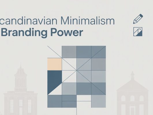
Brands are craving authenticity—and nothing says “real” like an imperfect typeface. Studios in Scandinavia and France are using hand-drawn, serif, or humanist fonts to soften digital interfaces and bring warmth to the user experience.
Perfect for: artisanal brands, ethical products, and eco-conscious companies.
Looking for design that connects emotionally? Reach out to us here.
🪶 4. Brutalist Typography (Still Going Strong)
You thought Brutalism was gone? Think again. This raw, gridless, heavy-type style is still huge in Berlin, Amsterdam, and London’s design circles—especially for experimental magazines, galleries, and indie brands.
Key features:
- Massive headers
- Monospace or bold condensed fonts
- No fluff—just function
Not for the faint of heart. But oh-so-effective.
Let us build your bold look.
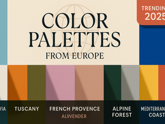
🇪🇺 5. Local Fonts with Global Appeal
Many design studios are tapping into heritage European typefaces. Whether it’s Bodoni in Italy, Didot in France, or Futura in Germany, classic fonts are being reimagined with modern tweaks.
It’s nostalgic, but fresh—just like good design should be.
Looking to stand out while staying true to your roots? We’ve got your back.
🧠 Why Typography Matters More Than Ever
Your typeface isn’t just decoration—it sets the tone before a single word is read. In a noisy digital world, strong typography cuts through clutter, builds trust, and makes your message memorable.
At Sceniox, we help brands in Europe and beyond choose type that tells a story. From minimalist tech startups to bold lifestyle brands, our typography choices are strategic, beautiful, and always intentionally.
📩 Ready for your type to do the talking?
Get in touch via email.
Or chat with us instantly on WhatsApp 👉 Click here
💼 Work With a Studio That Lives This Stuff
Want to elevate your brand with type that works hard and looks damn good doing it?
🚀 Check out our Fiverr gigs here: Get your brand’s typography on point
🔍 Explore all Sceniox services: See what we can design for you
🌟 View our freelance profile page: Meet your next designer
📈 50 Rankable Keywords (Paragraph Format)
This post explores the latest typography trends in Europe, including neo-grotesque fonts, variable fonts, and brutalist typography styles that are gaining traction in major European design studios. We examine how hand-drawn typefaces, humanist serifs, and heritage European fonts like Bodoni, Didot, and Futura are being reimagined in the branding space. With a focus on modern typography, minimalist branding fonts, and authentic type design, this article also highlights key movements in Scandinavian type trends, Berlin brutalist design, and French editorial typography. The rise of eco-conscious typography, local font revival, and UX-optimized type reflects how brands are blending tradition with innovation. If you’re searching for custom type solutions, modern font pairings, or clean type for logos, these European trends are worth exploring.
🏷️ 50 SEO Tags (Comma-Separated)
typography trends Europe, modern typefaces, neo grotesque fonts, brutalist typography, European design fonts, Scandinavian typography, modern serif fonts, variable fonts design, custom typography trends, authentic font design, hand drawn typefaces, humanist fonts Europe, European font design, clean branding typography, minimalism fonts, editorial typography Europe, branding with fonts, UX typography trends, creative typeface design, European graphic trends, Futura font use, Didot font in branding, Bodoni revival, typography in Berlin, French design fonts, UI fonts Europe, branding font pairings, timeless typography trends, Helvetica alternatives, sans serif trends Europe, aesthetic fonts Europe, emotional font design, type-focused branding, website typography trends, typography for logos, luxury font design, green branding typography, typographic logo design, artistic typefaces, cultural fonts Europe, typography in packaging, classic fonts with modern twist, letterform trends, studio typography trends, digital design fonts Europe, minimalist design fonts, impactful typefaces, modern branding fonts, aesthetic font combinations, typography-focused branding